Death by PowerPoint?
Feel the overload, name it, then rebuild a slide: working memory, two channels, readability.
For Participants
What participants bring
If you can, bring a slide you think is bad: one of your own, or one you've sat through.
At a glance
| Duration | 90 minutes. Session 1 of 3, one week apart |
| Group | 4–12 (works up to ~20; above ~12, “Show us” becomes a gallery walk). One facilitator can get round everyone during activities up to about 8 |
| Canvas box | Activities, part 1: the slides |
| Running artefact | One session each person teaches, or would like to teach |
| Shape | Experience → name it → use it. Theory in bursts of 10 minutes or less, used straight away |
| The ask | ”Before next week I will identify and redesign one or two slides (my own, or an example I find) and bring them.” |
The spine question is asked in the first ten minutes and answered on the canvas by the end of Session 3: What do we need people to do differently, and how will our teaching make that happen?
Learning outcomes
These are the content’s suggested outcomes. If your cohort’s differ, agree changes at setup.
By the end of the session, participants will have:
- Redesigned one slide to cut extraneous load, replacing text-plus-voice with image-plus-voice. (Redesign round 1)
- Checked and corrected the same slide for readability: size, contrast, no colour-only meaning (on a laptop, PowerPoint’s accessibility checker too). (Redesign round 2)
- Explained to a peer what they cut and who each remaining element is for. (Swap, Show us, “Who is this slide for?”)
- Written a specific plan to redesign one or two slides before next week. (The ask)
Before the session
The bad slide
- In the room: use any genuinely bad slide from your own organisation. Recognition is what makes it land. Keep it as a separate file and never publish or circulate it.
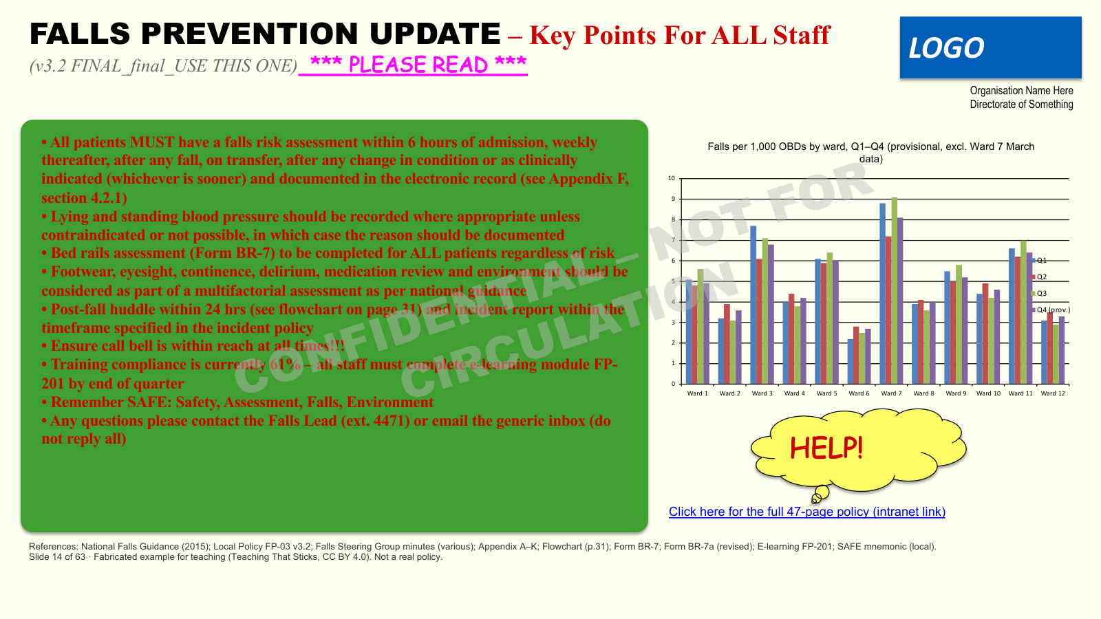
- Public deck and anything shared: use the fabricated “Falls Prevention Update” slide (cognitive_load_bad.png). It’s built from scratch, CC BY 4.0, and it’s the same slide participants see again on the cognitive load page: a reminder when they revisit.
- Set it to auto-advance after 30 seconds (Transitions → After: 00:30), followed by a solid black slide. No stopwatch.
The deck
The Day 1 deck as delivered: 23 slides, one idea each, built to the programme’s own rules (labels not sentences, no bullets, nothing meaning something by colour alone). Timings, prompts and credits are in the speaker notes. Tool slides show only the prompt (slide 8: “What do you remember?”), so they work with Menti or a flipchart without editing; the notes say how to run each. If you have one, swap in your own organisation’s bad slide on slide 6 (never publish it).

The slide kit (paper first)
Both redesign rounds start on paper. The kit takes apart the fabricated “Falls Prevention Update” slide: a 16:9 frame with a heads zone and a speaker-notes strip, then titles, the message at four densities, sizes, contrast chips, pictures, charts, noise and some “almost good” pieces worth arguing about. The task: build one slide that helps a nurse do one thing before leaving the bedside. Choose, arrange, discard; what’s needed but doesn’t belong on the slide goes in the notes strip. Image credits are on the last page.
Paper takes the computer out of the way (no extraneous load from the tool), and the kit makes it a completion task: everything’s there, the skill is choosing. People who are comfortable with PowerPoint can take the laptop route instead: their own slide, one from the bad-slide pack, or the same falls slide.

The design canvas
Shown in the first ten minutes (the six boxes) and completed in Session 3. Print one each if you’d like people to keep it in front of them from today; it’s also on their Session 1 page.
Assume nothing
Many won’t teach yet, won’t have a slide, or won’t have seen the message. And don’t assume digital skills: in the second cohort, several people didn’t know Shift-click or “save a copy”, and one didn’t know how to open the internet. It wasn’t who the facilitator expected. Plan for it:
- Bad-slide pack: 3–4 bad slides, printed and on a laptop (include the fabricated one).
- Find one live: search the intranet or shared drive for
.pptx. There is always one. - Running artefact: “a session you teach, or one you’d like to teach”. Non-teachers pick a topic they know well.
- Task sheet: print the Computer Task Sheet for anyone taking the laptop route, and for the Session 2 ask. Scaffold only the computer tasks the programme needs; below that floor, pair people up, use paper, and signpost the organisation’s IT or digital skills support.
The colour-vision moment
If you know someone in the group is colour-blind, ask them privately beforehand whether they’d be happy to say so. Never put anyone on the spot.
Room and kit
- Whiteboard and non-permanent pens
- Cards for the ask (one each, plus spares)
- Visible timer
- Menti open on your laptop (“What do you remember?” word cloud loaded; QR code big enough for the back of the room)
- Bad-slide pack, printed and digital
- Slide kits: printed, cut up and in envelopes (one per person or pair), plus a frame sheet each
- Scissors, Blu Tack or glue sticks, pens
- Seats in groups, not rows
Session flow
0–9 · What makes a good teacher? → the spine → the canvas
- ASK: “What makes a good teacher?” Scribe answers on the whiteboard. Let it run.
- SAY (only once nobody has said it): did anyone say “good slides”? Hold onto that.
- SAY: the question for all three weeks is what do we need people to do differently, and how will our teaching make that happen? Most teaching starts with the content or the agenda. We’ll start with the change.
- SAY: show the six-box canvas (Learners & context · Need · Outcomes · Evidence · Activities · Follow-through). One of your sessions, rebuilt over three weeks. Today, the most visible bit: the slides.
- ASK (2 minutes, hands up): who’s used Menti? Who can save a copy of a file? Select several slides at once? Note who’s confident, for pairing later. SAY: this is the canvas’s first box, learners and context, applied to this room.
- WHY: adults learn from what they bring (andragogy). The canvas is a map they’ll see at every move, and it plants constructive alignment before it’s named.
- IF SHORT: three minutes on the opener is enough. Never cut the canvas.
9–14 · Look at the next slide → bad slide → what do you remember?
- SAY: “Look at the next slide… No notes, no phones. It disappears after 30 seconds.”
- The bad slide shows for 30 s, auto-advances to black. Say nothing while it’s up. Silence is the point.
- ASK: “What do you remember?” One or two words each: a Menti word cloud shown alongside the slide, or shout-outs onto the flipchart. Read them out; let the laughter happen.
- WHY: concrete experience before theory (Kolb). They feel the overload, then test their own recall.
- FALLBACK: shout-outs onto the whiteboard.
14–22 · The bottleneck → the adverts → two channels
Three bursts, each three minutes or less.
- Bottleneck. SAY: small working memory (about four items), huge long-term memory, a narrow bottleneck between. Learning is getting through it. A full slide rests your memory and taxes theirs. On the retrieve arrow: “remember this arrow; it comes back next week.” WHY: ~4 is Cowan (2001), revising Miller’s 7±2. → cognitive load
- Adverts. Dark, unlabelled slide: busy Black Friday ad scan, then the clean MacBook advert. ASK: what do you notice? (Wait 5–8 s.) SAY: some load belongs to the topic (intrinsic: scaffold it, can’t remove it). Some is noise (extraneous), and that’s the part we control. Everything on the bad slide was noise. WHY: keep it to two types. Germane load is contested; mention only if asked.
- Two channels. Text + Voice competes ✗. Image + Voice complements ✓. SAY: notice what’s happening now: a diagram, and me talking. WHY: dual coding is Paivio; the slide principles (redundancy, modality) are Mayer’s. Printed words compete with the pictures for learners’ eyes; a few key words are fine. Not “always add images”: a busy infographic is more noise. → dual coding
- IF SHORT: never cut the bottleneck or two channels.
22–39 · Redesign: round 1
- SAY: one slide, on paper. Open the envelope: build one slide that helps a nurse do one thing before leaving the bedside. Pick your pieces, cut the noise, image plus voice. Anything needed that doesn’t belong on the slide goes in the speaker-notes strip. 15 minutes, then 2 minutes swapping with a neighbour: what did they cut?
- LAPTOP ROUTE (if you’re comfy): the same task in PowerPoint, on your own slide, one from the bad-slide pack, or the falls slide. Offer it; don’t push it.
- WHY: apply it straight away, while it’s fresh. Paper removes the tool’s extraneous load, and the kit makes it a completion task: the skill is choosing, not finding the menu (cognitive load).
- SHOW FIRST (laptop route only, at their tables): expect basic PowerPoint gaps (in the second cohort, selecting several slides was a mystery). Shift-click or Ctrl-click (Cmd-click on Mac) to select slides, right-click → Duplicate slide, Ctrl/Cmd+Z to undo, and switch off Designer suggestions.
- WATCH FOR: the “almost good” pieces. They’re there to be argued about, so let the arguments happen. And “my organisation’s template won’t let me”: acknowledge it; park it for Show us.
- IF SHORT: cut the swap, not the redesign.
39–44 · Who can see all the numbers? → Readable?
- Three Ishihara plates. ASK: who can read every plate? Voluntary: share only if you’re comfortable. Then reveal: about 1 in 12 men, 1 in 200 women. SAY: in a room of 15, odds are someone sees this differently, so colour never carries meaning on its own. Don’t linger.
- Size ladder, three “Hard to read” colour pairs, then the 0–9 contrast strip, then the heads appear over the bottom of the screen (deliberately). ASK: from where you’re sitting, where does it stop being readable? SAY: 24pt or more, strong contrast, nothing important at the bottom. On a laptop, PowerPoint has a checker; the laptop route uses it next.
- WHY: accessible means less extraneous load for everyone. → WCAG quick reference
- IF SHORT: fold “Readable?” into the round 2 instructions.
44–59 · Redesign: round 2
- SAY: same slide, accessibility pass. Readable from the back; no colour-only meaning; nothing in the heads zone. Swap pieces for bigger or higher-contrast ones. Then hold it up across the room: can the far side read it? 15 minutes.
- LAPTOP ROUTE: the same checks, plus Review → Check Accessibility.
- WHY: two short theory-then-practice cycles beat one long lecture plus one long task. Holding it up makes “readable from the back” a test, not a claim.
59–71 · Show us
- SAY: 2–3 volunteers, before and after. Room responds with one thing that works, one question.
- WHY: peer slides are worked examples; the two-part frame keeps feedback specific and kind.
- WATCH FOR: the mandated template. Agree it’s real; ask what’s still in their control (fewer words, images, size, order).
- Larger group: gallery walk, slides (and laptops) on the tables.
- IF SHORT: cut this first, down to one volunteer.
71–77 · Who is this slide for? (four slides)
- The question on its own. Pause, click on.
- The typical slide: white, bullets, every detail. READ EVERY WORD ALOUD, facing the screen. That’s the experience. Don’t comment.
- Rebuilt: the cat, “Who is this slide for?”, then ✓ the learner / ✗ your memory. ASK (think, don’t answer): ever put everything on a slide so you wouldn’t forget it? SAY: that was a security blanket. It was for me.
- Presenter view (Morph transition): the slide shrinks to a thumbnail and the detail appears as speaker notes. “The detail didn’t disappear. It moved.” SAY (scaffolding): notice what changed between those slides. Eight ideas at once, versus one idea, then a click for the next. Chunk it, order it, reveal it when they’re ready, then take the support away. You’ve had that all session: small pieces of theory, two redesign rounds with less help each time. The slide is one step; your notes hold the sequence.
- WHY: constructive alignment at slide scale (it returns at session scale in Session 3); scaffolding (Wood, Bruner & Ross, 1976) and Mayer’s segmenting principle. → zone of proximal development
- IF SHORT: read only the first four bullets aloud. Never cut the presenter-view slide.
77–79 · “But sometimes the best slide is… no slide at all”
- SAY: hold that thought for next week.
- IF SHORT: never cut. It takes ten seconds.
79–86 · The ask
- Show the card wording: “Before next week I will identify and redesign one or two slides (my own, or an example I find) and bring them.”
- SAY: write it on the card now. Add which slides or where you’ll look. Photograph it. Next week starts with what you did.
- SAY: no slides of your own? The ask is to find one (intranet, a lecture, a training day) and fix it.
- WHY: a specific, written intention with a built-in follow-up. → implementation intentions
- IF SHORT: never cut. Start it at 79 minutes, even mid-discussion.
86–90 · Close (and buffer)
- SAY: thank you. Next week starts with your slides. The closing slide has a QR code to the website: the session recap is there.
- Optional: a one-question pulse (see the Evaluation Toolkit).
After the session
- Photograph the room’s cards too (with permission), so you can read the asks back.
- Next session opens by reading the ask back: “Show us your slides.” Bring the bad-slide pack again for anyone who didn’t get to it.
- Send the pre-Session 2 message. Keep it to the ask.
- Note anything that ran long. Activities run long (the second cohort needed the full 15 minutes each); Show us is your buffer.
- Evaluation sits in one place: the Evaluation Toolkit. For the canvas as six questions, share Before You Plan a Teaching Day.
What this session draws on